

Reorganizing Customer Journey.
72Hours.ca - Website redesign.

Brief:
72Hours.ca asked to redesign their e-commerce website and organize a warehouse full of survival/first aid kit products in a more meaningful way for customers.
The website should promote new products, be easy to navigate and customers should understand products at a quick glance.
My involvement
Role
I was the sole designer responsible for the project.
Method
Competitive Analysis, Lean UX Methods, Site Mapping, User Personas, Paper Prototyping, Digital Wireframes, UI Design - Sketch App.
Duration
2 months - Side job.
Market Research

Amazon
Online Marketplace
Smaller header = fit more products below
Personalized shopping - user trends and deals
Costco

Online Wholesaler
Sales and deals prominent
Product focused (paid hierarchy)

Mountain Equipment Coop
Brick and Mortar retail stores
Showcase lifestyle
Product focused (by activity)
Goals of Feature Comparison
How does a website be more accessible for users
What draws users back to the website (retention) and discover new products
What makes a website personal to the user
Main Findings of Market Analysis
Users like a more personal experience (recently viewed)
Suggested/featured items draw discoverability
Users are attracted to images and leads to a memory or story they’ve experienced.
Trust buying from this website - adds an intrinsic value to the product they are buying.
Problem Statement
Attract users and encourage discoverability of products - while making a trustworthy & personal shopping experience.
Persona

Site Map
Low Fidelity Wireframes
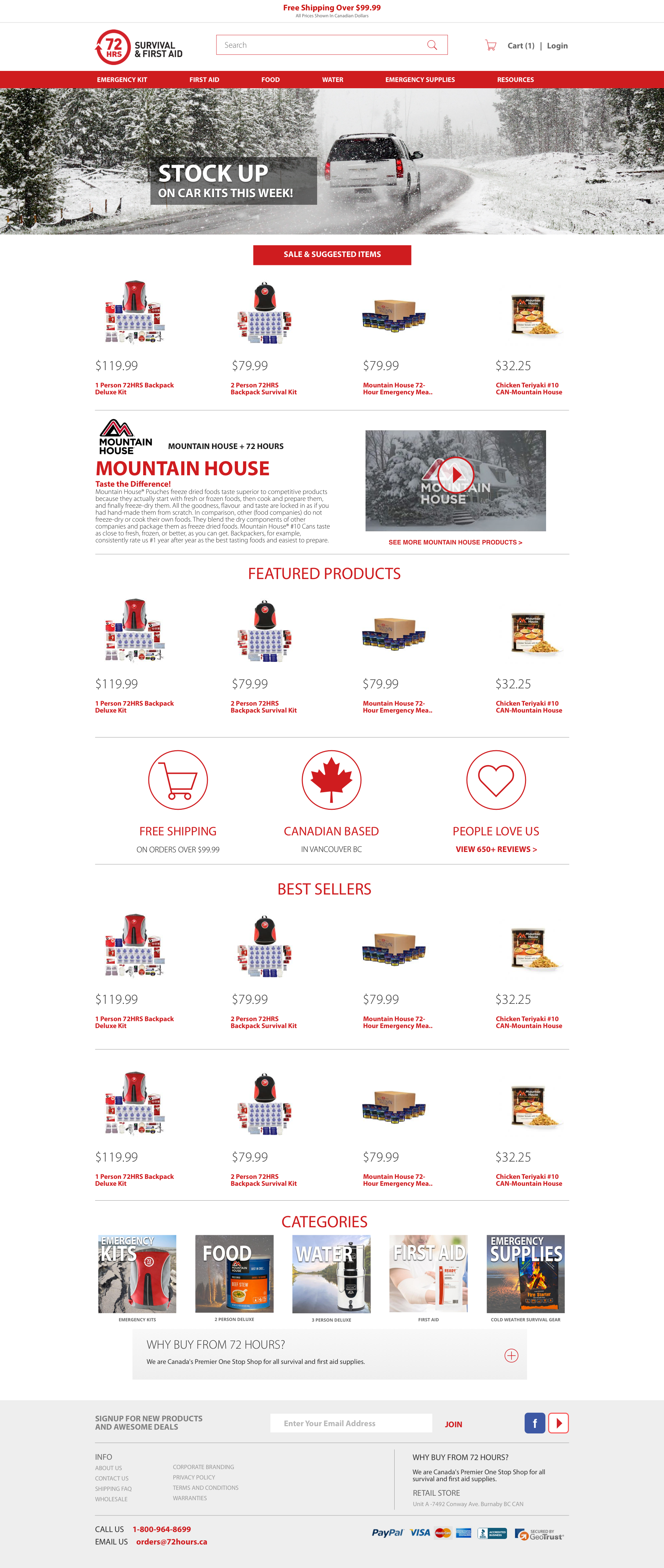
Prominent banner - humanize the homepage and a place for seasonal deals/sales
Large category buttons for accessibility
Featured products
Best Sellers
Add “Who We Are” section (Canadian company etc.)
Add review section
Larger product images
Better font/hierarchy for product description
Add an interactive map to show regional regulations
Large interactive buttons
Large banner image to add humanization.
Banner also leads to familiarity to category/page
Categorize sections corresponding to items first and not quantity
High-Fidelity Wireframes

Video section to add discoverability and user engagement + product knowledge
Trust section - Free shipping, Canadian Based, Number of sold products
Large sections for users to come back to - featured items, best selling, previously viewed

Large image carousel
Before and After pricing
Review section + Star rating
Previously viewed items at the bottom of the page

Large header images and text area for description
Large category images for ease of clicking
Area for top selling items for each category

Ample areas for product description
Video section to provide additional user engagement
Top selling categories
Area at the bottom to drive Trust
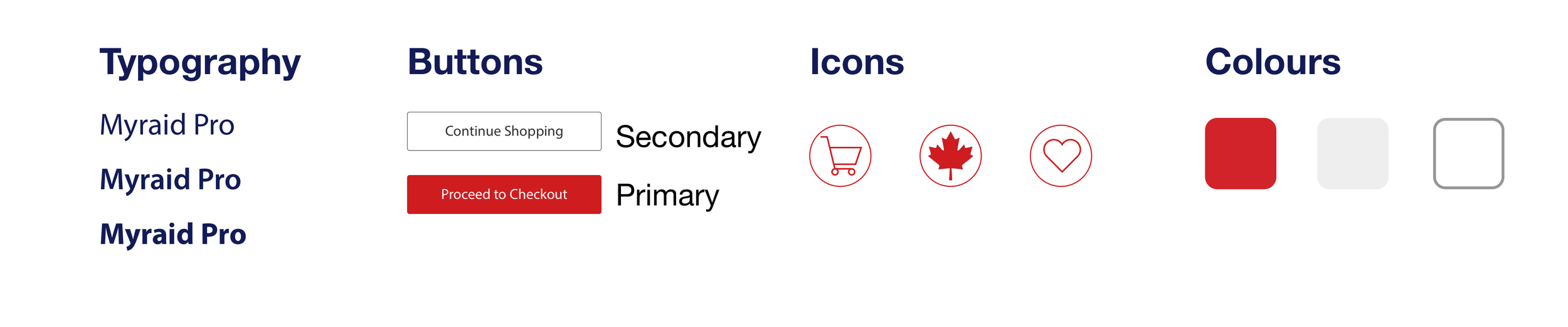
Branding
Imagery


Allow experienced customers to buy products efficiently.
Improve product knowledge and trust.
Add discoverability of featured, best selling, and previously viewed products.
Improve user journey and brand identity of inexperienced users through large imagery, text descriptions and video.
Results:
Conclusion
This project increased my value as a designer to the company owner and provided clear progression, guideline and planning. We’ve increased new customers on their website, retail store, and customer retention. The company’s success followed by increasing their employee count from 10 to 50 people over the years. Worked closely with the owner and delegated his focus on different aspects of the design to reduce the amount of iterations and redesign. Overall the website is a success. I would have conducted further user testing to prove the design hypnosis and user journey.